SquareBeat is Ready

Today I’m happy to announce something I’ve been working on for 10 years. I started this app in 2013, when I was basically a kid. Many gray hairs later, it’s finally done. And I have to say I’m pleased with the results.

SquareBeat is a tracker (a music sequencer) app for iPhones. The motivation for this app came from the realization that smartphones… they’re shaped like trackers. The long vertical shape is perfect for trackers. One channel of a tracker fits perfectly on an iPhone screen. Then I came up with the idea that you could just slide between channels from left to right. So you have this sense of space, of where you are in the location of the song. That sense of space would be reinforced by the ability to zoom out, and look at the whole song.

This was around the time iOS 7 came out. There were a lot of apps at that time that had this cool new ability to go from the macro view, and zoom in to the micro view. So there were different layers of depth, that we animate between. The iOS calendar app is a good example of that. The Photos app did it too. You could use animated and interactive transitions to give the user a sense of moving through the space of your app.

When I started floating this idea to people, some people thought it was weird. They thought putting a tracker on a touchscreen was weird, because trackers are usually driven by keyboards. That’s true. But what I realized is that you can make a good touchscreen tracker if you use the strengths of the touch screen. So PC trackers usually use the tab key or something to let you switch channels. We just replace that keyboard action with a gesture. We can swipe. For note input, we use a little piano. For other tracker input, just use a slider or button.

With this approach we can make a good touch app, and also make trackers easier to use. Take effect commands for example — one of the hardest things for users to dive into. With a keyboard, the user needs to know every command they want to use, and exactly what input it takes. So they need to have read an instruction manual before using commands. But what if the interface could just show you all the commands, and show you exactly what the input parameters do, and even disallow you from entering bad values?

We show the letter of each effect command, then when you select a command, we show labeled sliders for each parameter input. Everything you need to know about the command is there. It’s called Down Pitch, the command is D, it has two input parameters, I enter them with a slider. No keyboard is needed, the effects are self-documenting, and I would say data entry is pretty fast. I also just added a little information button, when you push it it just tells you in plain English what the commands are and how they work.

There is a certain type of person who loves to go read instruction manuals when they get something new. And you can totally read the manual, it’s there. But I think most people want to get in there and experiment, and learn as they go. Like playing a game. Games teach you how to play them. Ideally, I think it would be nice to have most software work that way. That’s the ideal, anyway.

I also wanted this thing to be usable with one hand. You can write a song with just one thumb on this thing, which makes me happy.

Those are the main things I was thinking of. I honestly think this is the best way to edit music on a phone screen. At any rate, it’s better than a damn piano roll. 😜

Please check out the new app, and then rate it!

Link to app page

Freesound Client

I’ve been busy working on a client for Freesound.org. If your not familiar with the site, it’s a huge collection of audio samples for people to use. Need a sound of a wooden fence breaking? It’s there. Need the sound of a coin slot machine working? It’s there. The sounds have various licenses, some of which stipulate that you need to give proper attribution. Some samples are totally public domain, and need no attribuition. It’s a great public resource and I’m stoked to make it more useable on iOS. I’m not sure when I’ll be releasing the app, but I’ve learned a lot already, and am having a lot of fun. Here’s a video.

TB-303 and Polyrhythms

The lasting love and affection for Acid music is as evident as ever. Part of what people love about it is no doubt the hard, squelchy sound of the Roland diode-ladder, analog filter. That filter is a defining characteristic of acid as a genre.

But the real heart of the sound, the thing that gives it a lot of “play”, and joy through repetition, is the unity of percussion and melody created by using the filter with the TB-303 style sequencer. The TB-303 is often used as sort of a polyrhythmic instrument, where rhythms kind of emerge and disappear as the musician turns the tiny aluminum knobs.

wikimedia.org/wiki/File:Roland_TB-303_Panel.jpg

wikimedia.org/wiki/File:Roland_TB-303_Panel.jpg

These subtle variations are afforded by a few different mechanics. The most important is probably the Accent modifier, and the way it affects the filter and gain. You can set any step to be an accented step, and then you use the Accent knob to change the amount of the Accent. If you set it low, the Accented notes are almost the same as the regular notes , and the whole thing blends together a bit, in terms of the filter cutoff and volume.

As you raises the Accent, those accented notes will start to stand out more, and punctuate certain parts of the sequence. This can drastically change the rhythm of pattern, and of course changes the timbre of each note more dramatically. That’s because Accented notes raise the filter cutoff and the volume, for that note, as well as changing the Filter Envelope decay. The Env Mod knob also changes the rhythm of the pattern and percussion of each note, by increasing the slope of the filter envelope. So it makes every note, excluding slide notes, punch harder out of the mix. The sliding notes fade into the background, and the Env Mod and Accent create a counterbalance of focus between different sets of notes. These mechanics blur the line between melody and rhythm.

So you can have a kick drum beating away, and explore many subtle polyrhythms, and textural variations, with just a few knob twists. This is what leads to the drone-like quality of a good acid song, and raises our tolerance for the looping, repetitive nature of the music.

A Call to ARMs

Greetings outlander! Gather in for a story, about warring global tech conglomerates, and the strange creatures that orbit them. Events foretold are coming to pass! Yes I’m talking about WWDC 2020!

Previously I have written about the eventual iPad-ification of the Mac, and boy howdy… it’s pretty iPaddy this year. ARM-based Macs have been announced, and developers are now scrambling to figure out how to port their current Mac apps to this new chip architecture. Apple expects to deliver the first consumer ARM Mac sometime this year. Some big companies have already begun rebuilding for this (Microsoft, Adobe).

So on a surface level, we’re going to have to start thinking about how we’re going to get our old Mac software over to these new machines. On a deeper level, running MacOS on the same chip as an iPad means that we will have real software compatibility between the two platforms. Apple has also shown us that these new Macs will run iOS and iPad apps straight out of the box. No Catalyst, no intermediating software layer. iOS apps will run natively on this new hardware.

So this is all very exciting, and there are many deeper implications to explore (such as when are we going to get touch-based Macs). But what does this mean in the near term for iOS music apps?

The first thing that comes to mind is AUv3 plugins. It’s likely that we will eventually be looking at MacOS apps that host AUv3 plugins. That’s going to drop a pretty huge amount of music software right into Mac workflows. It’s also going to make iOS software more credible as “Pro” software. For years and years iOS has shown a tendency to drive software prices down, and showcase apps that people love to play with, but are not very productive or professional. This will almost certainly alleviate that trend, by making iPad software useable with a mouse and keyboard, and by associating iOS apps with a an OS people associate with productivity (The Mac). For years we’ve been wondering when iPads were going to get “real” pro quality software. This is an answer.

So what is Catalyst a catalyst for? Its catalysing a new flow of software to the Mac, and in reverse, a new flow of features to the iPad. Simply by virtue of now being Mac compatible, I think there will be a backward influence of more desktop-like features on iOS.

On the PC side, the music software market has largely been insulated from the effects of the various App Stores. The PC market is dominated by huge players who make really expensive software, called DAWs. Everyone else just makes plugins for those entrenched Host applications, like Cubasis, Ableton Live, Logic, etc. It’s still unclear how that market will be affected. Once AUv3 plugins are widely available on Mac, there’s a real possibility that VST software will lose some value. Though I think the hope is, that instead of ruining the high value and quality of Mac apps, there will be a kind of equalization, where iPad software becomes more powerful and high value, and the Mac software market will become more squishy and ripe for new innovative software.

Hopefully the injection of new software from iOS, and new interactions enabled by yet-to-be-announced Mac hardware, will create fertile ground for a market that has become ossified.

Web App Time

As we wade further into an era of questioning the scale of and regulating tech companies, the question of the AppStore having a lock on app distribution has again become a topic of interest, mentioned recently by no less than Elizabeth Warren. Apple has many justifications for why native apps are limited to AppStore distribution. The chief one seems to be security. Allowing third party native apps from other app stores certainly would raise the risk for iPhone users. But the current policy gives Apple the onerous job of regulating tricky ethical issues, such as the Hong Kong iOS app recently pulled by Apple.

So one defense raised on Mac Break Weekly this week is the idea that Progressive Web Apps can offer an alternative for providing software that competes with native AppStore apps. My question is, can web apps really compete with native apps? Are they ready? I have seen some very impressive web apps recently, like Ableton’s web apps for learning about digital music.

From what I understand, Abletons apps use WebASM to achieve low latency audio. I am skeptical, but of course I am biased. I write native apps. I will probably never write web apps. It’s just not my thing. But I am curious. Are there other good examples of high performance web apps? Can a web app ever get the kind of access to hardware sensors that native apps have? What is the model for funding web apps? I don’t know! But I do love to play with these things.

Edit: This may also be related, Apple has changed the rules for native apps. You are not allowed to use web views for ”core features and functionality”.

Click Life

Hi. So I just submitted a couple of Loop Find updates (version 1.1.1 and 1.1.2) that fix some bonehead audio bugs I made. I thought it may be worth sharing a little though, because these are easy mistakes, and this provides some evidence to back up the conventional wisdom we hear about real time programming.

The first is an interpolation error. I use cubic interpolation to resample the samples in Loop Find. It's a 3rd order B-Spline. So the actual implementation requires 4 samples, starting one place to the left of the currently required sample. That helps it to be more accurate, sound nicer.

So at the beginning of sample playback, you need to handle the negative sample on the left; when it plays the end of the sample you need to handle 2 trailing samples that reach over the end of the sample buffer, on the right (what is a sample?). Otherwise you will reach outside of your buffer and be grabbing unknown data, and using that for playback. I did the second one, I was not assigning zeros in place of the overflowing samples at the end.

I would've thought such a thing easy to detect, because it would pop and click, but because of the way memory in my app is structured, those dangling samples at the end of the buffer would be zeros (so, harmless) unless the next track was playing. So the bug would exhibit itself only when these conditions were true.

  1. A sample pad was playing the end of it's sample.

  2. The next sample pad was playing.

That was bad enough. The other thing that was causing some clicking was something called dispatch_async( ). When I start playing a sample on the real-time audio thread, I have to signal the main thread so it can update the UI. I was doing that by queuing a block of code on the main runtime loop, using a function called dispatch_async( ). Don't do that. I thought it would be okay, and have done it sparingly in the past, even though I had been advised that the function does do some allocation, and therefore is not safe to use on the real-time thread.

So the bug was not very consistent, but once I had started building songs that had a whole bunch of samples triggering and automating a bunch of things, it started popping up enough that I noticed it, and dedeuced that it was likely do to those asynchronous GCD calls. They are doing allocations, and are not safe to use from the audio thread, or so was asserted in this WWDC 2015 session talk (https://developer.apple.com/videos/play/wwdc2015/508/).

So yeah, don't do these things. I had to just poll the state of the samplers, with an NSTimer, from another thread, and update the UI when something changes, which solved the problem.

Edit: Changed wording, Grammer. Added sample link. Math error…

Introducing Loop Find

Today marks a big day for me as it's the first day that other people will get to try out Loop Find, an app I started earlier this year.

The motivation behind the app was to get back to basics with hands on sample manipulation. I have worked on synthesizers a lot for the past ten years or so, and I miss working with samples. There is something very satisfying about warping and layering recorded sounds.

I grew up using the MTV Music Generator, for Play Station, which was basically a sampler with a big library. The sounds were often pretty lackluster, and lets just say pretty vanilla. But the magic of it would be when you would take something that sounds pretty generic and unimpressive, and just by changing the speed, pitch, and envelops, and with a little love, you could compose a song that exceeded it's humble origins.

Basically Loop Find is a groovebox that lets you cut through samples very quickly and easily, automate the parameters, and make songs. It’s also a very good “sound design work bench.”

This will be a process much like SquareSynth 2, I think. Which means I'll be taking in user feedback, making adjustments, even adding new features. I look forward to going on this journey with you.

~ Sample Fox 🦊🔉

Reassessing iOS 7

I am a technology nerd, and an introvert. I often find little threads that internet people are pulling on, and start pulling them myself. I need little things to chew on throughout the day. So it is with great joy that I read John Gruber’s latest post about his request for iOS 13.


“Classic iOS”

“Classic iOS”

Modern iOS

Modern iOS

   “I don’t know why, but one of those things has been bugging me a lot in recent months: the drab gray color that indicates tapdown state for list items and buttons. Putting aside skeuomorphic textures like woodgrain and leather and the 3D-vs.-flat debate, the utter drabness of tapdown states is just a bad idea.”


So Gruber’s request for iOS 13 is very modest. He wants a nicer looking tap-down color on lists and buttons. But this modest request is actually emblematic of a larger complaint people seem to have about the modern iOS look: it’s joyless.


  “The classic iOS style was both joyful and a perfect visual indication of what you are tapping. It was both aesthetically pleasing and more usable. It’s useful — and accessible — to make crystal clear what exactly you are tapping on. The classic iOS look-and-feel made it feel fun just to tap buttons on screen. I miss that. Again, put aside specific techniques like photorealistic textures and depth effects. To me the fundamental weakness in post-iOS-7 look-and-feel is simply that it’s been drained of joy.”

I’ve heard this complaint about iOS 7 from many people. I don’t want to over-generalize, but I’ll just say that the people that I personally have heard it from tend to be old-school Mac addicts. Apple heads. Hardcore, pinstripin’ HyperCard fiends. iOS used to be filled with delight and whimsy, like OS X. It also lost a lot of helpful visual elements.


On the other end of the spectrum, a lot of people were really turned off by the bright colors of iOS 7. The new animations have also been pretty controversial. It’s easy to forget what jarring changes these were, which is probably why Apple has been toning them down, and refining them, since the first beta release. In respect to color and animation, iOS 7 was maybe a little too joyful.  Too playful.

iOS 7, beta release 1

iOS 7, beta release 1


The fairest way to characterize the response to iOS 7 is that it was ‘mixed’. There was a sense in 2013 that Apple needed to modernize things. Windows Phone had been impressing people, with their minimal, type-centric design. Android had some very cool looking animated wallpapers, widgets, flat icons. iOS was starting to look dated. So the sense was, they needed a refresh, but they may have missed the mark.


Steve Jobs introducing iPhone OS

Steve Jobs introducing iPhone OS

The original proposition for iPhone, is that this thing is a real computer, in a phone. You can tell it’s a real computer — not just by the fact that you get a big giant color screen, and a real web browser — but by the fact that it’s running a variant of OS X. iOS wanted to pull you in with a nice, familiar look and feel. The OS X look and feel.


Eventually it became clear that smartphones were actually a new class of computer, which brought us into a new, very personal relationship with computers, and the old ‘lickable’ designs were no longer appropriate.  So Apple put Jony Ive at the helm of iOS and took a chance.


I think that iOS 7 took some great strides forward. The idea of using depth, not just as a stylistic flourish, but as a way of organizing different information. The idea of maximizing  content on the screen, and stripping away GUI chrome. They sanded off a lot of unnecessary cruft that was imported from the PC era. The blue highlight color with white text (classic PC look), the pinstripes, the gradients, the textures, shadows, unnecessary visual metaphors (the book shelf, the reel-to-reel podcast, cover flow). A lot of that stuff looked so great on a PC monitor, like 15 inches away from your face. But it was not optimized for these strange new companion devices. So a sacrifice to the gods of minimalism was absolutely needed.


But I think there’s some consensus that they went too far, and stripped away useful things, as well as the little unneeded things that brought us joy. So, though I don’t have strong feelings about the touch-down color specifically, I agree that it’s time to start adding some personality and usability back into it. Now that we’ve stripped out the excesses, Apple can figure out what was really useful (for accessibility and usability). They can start adding more lines and complications back into the mix, and hopefully have a little fun with it. Redefine lickability for a new era.

Edit: If you look at specific apps, there are little things sneaking back in. The Apple Music app is very colorful, and the buttons look like buttons, and I believe they have that pink Apple Music tap-down color.

Screen Time Rehab

Hi, I’m James, and I’m a recovering smartphone addict. (Hello James). I used to wander aimlessly from app to app. Social Media, YouTube, Google — hey what was the name of that girl from Gremlins? Wonder how she’s doing... things like this. And yea, I was lost in the darkness, as an angler fish with no nose light. I once was blind, but now I’m lit. It’s an indisputable fact that I have poured an inordinate amount of time and attention into smartphones. I’m not alone. Adults in the United States spend 3 hours and 35 minutes on smartphones per day, on average. People aged 18-34 watch 105 minutes of videos per week on their phones. That’s a lot of make up tutorials.


Its not just a matter of time spent, but the quality of time. The cognitive load, and the residual effects that last even after the phone is off. There is mounting evidence that smartphones are changing the way our brains work.  Its an an assault on your senses.


So I have come up with a few strategies for managing my smartphone use. 


Home Screen Cleanse  

Here’s what my home screen looks like.

IMG_0797.PNG

​As you can see it’s pretty spartan. Only apps which would be most commonly used go here. Things that I use often, or may need to use in real life. You may also notice that the wallpaper is grey. For comparison, here’s the not-grey version.

IMG_0792.PNG

It’s quite eye catching. It evokes ideas of futurism, technology, design, and elegance. But it’s like moving your work desk to the warp core of the star ship Enterprise. So I’ve found it’s better to desaturate my wallpaper with the ‘mono’   photo filter. Many have suggested switching your whole phone to black and white mode. That is a great tip. But some of us need color. Some apps use color for navigation, or categorization. I’ve been known to design an app or two. So I leave it on. The wallpaper trick works surprisingly well though.


The most important apps go on the first page of the home screen. Each folder name is verb. They ask, what do you want to do?

IMG_0795.PNG

The second page is for everything that I couldn’t justify putting on the first page.


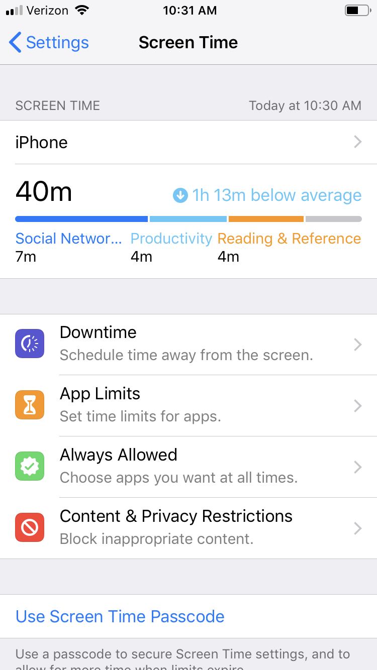
Screen Time

Apple is a forward thinking company when it comes to smartphones, so it should come as no surprise that they were the first to announce a ‘Screen Time’ control manager.  

IMG_0796.PNG

The Downtime  section can be used to set a special ‘restricted time’, where only certain apps are available. You can use it like no-bite nail polish. If you want to avoid Twitter during the work day, and get in on some of that Deep Work, this feature will be your wrist slapper. 


You can also set time limits for each app, or category of app. Keep an eye on this screen, you may be surprised by what you see. 


We are creatures of habit. Hopefully smartphone makers will create new ways to help us structure our phone use. In the meantime, with just a little planning up front, you can set yourself up for a better smartphone experience.