SquareBeat is Ready
Today I’m happy to announce something I’ve been working on for 10 years. I started this app in 2013, when I was basically a kid. Many gray hairs later, it’s finally done. And I have to say I’m pleased with the results.
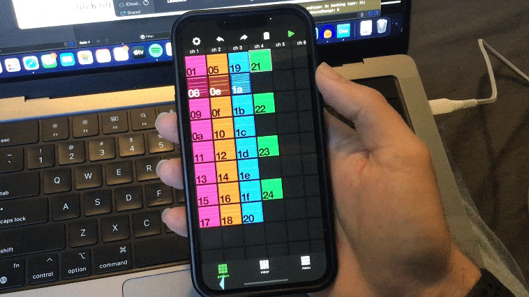
SquareBeat is a tracker (a music sequencer) app for iPhones. The motivation for this app came from the realization that smartphones… they’re shaped like trackers. The long vertical shape is perfect for trackers. One channel of a tracker fits perfectly on an iPhone screen. Then I came up with the idea that you could just slide between channels from left to right. So you have this sense of space, of where you are in the location of the song. That sense of space would be reinforced by the ability to zoom out, and look at the whole song.
This was around the time iOS 7 came out. There were a lot of apps at that time that had this cool new ability to go from the macro view, and zoom in to the micro view. So there were different layers of depth, that we animate between. The iOS calendar app is a good example of that. The Photos app did it too. You could use animated and interactive transitions to give the user a sense of moving through the space of your app.
When I started floating this idea to people, some people thought it was weird. They thought putting a tracker on a touchscreen was weird, because trackers are usually driven by keyboards. That’s true. But what I realized is that you can make a good touchscreen tracker if you use the strengths of the touch screen. So PC trackers usually use the tab key or something to let you switch channels. We just replace that keyboard action with a gesture. We can swipe. For note input, we use a little piano. For other tracker input, just use a slider or button.
With this approach we can make a good touch app, and also make trackers easier to use. Take effect commands for example — one of the hardest things for users to dive into. With a keyboard, the user needs to know every command they want to use, and exactly what input it takes. So they need to have read an instruction manual before using commands. But what if the interface could just show you all the commands, and show you exactly what the input parameters do, and even disallow you from entering bad values?

We show the letter of each effect command, then when you select a command, we show labeled sliders for each parameter input. Everything you need to know about the command is there. It’s called Down Pitch, the command is D, it has two input parameters, I enter them with a slider. No keyboard is needed, the effects are self-documenting, and I would say data entry is pretty fast. I also just added a little information button, when you push it it just tells you in plain English what the commands are and how they work.
There is a certain type of person who loves to go read instruction manuals when they get something new. And you can totally read the manual, it’s there. But I think most people want to get in there and experiment, and learn as they go. Like playing a game. Games teach you how to play them. Ideally, I think it would be nice to have most software work that way. That’s the ideal, anyway.
I also wanted this thing to be usable with one hand. You can write a song with just one thumb on this thing, which makes me happy.
Those are the main things I was thinking of. I honestly think this is the best way to edit music on a phone screen. At any rate, it’s better than a damn piano roll. 😜
Please check out the new app, and then rate it!