Reassessing iOS 7
I am a technology nerd, and an introvert. I often find little threads that internet people are pulling on, and start pulling them myself. I need little things to chew on throughout the day. So it is with great joy that I read John Gruber’s latest post about his request for iOS 13.
“Classic iOS”
Modern iOS
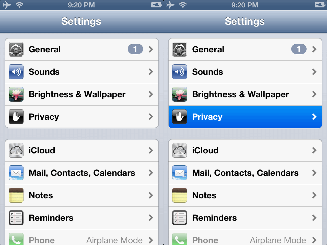
“I don’t know why, but one of those things has been bugging me a lot in recent months: the drab gray color that indicates tapdown state for list items and buttons. Putting aside skeuomorphic textures like woodgrain and leather and the 3D-vs.-flat debate, the utter drabness of tapdown states is just a bad idea.”
So Gruber’s request for iOS 13 is very modest. He wants a nicer looking tap-down color on lists and buttons. But this modest request is actually emblematic of a larger complaint people seem to have about the modern iOS look: it’s joyless.
“The classic iOS style was both joyful and a perfect visual indication of what you are tapping. It was both aesthetically pleasing and more usable. It’s useful — and accessible — to make crystal clear what exactly you are tapping on. The classic iOS look-and-feel made it feel fun just to tap buttons on screen. I miss that. Again, put aside specific techniques like photorealistic textures and depth effects. To me the fundamental weakness in post-iOS-7 look-and-feel is simply that it’s been drained of joy.”
I’ve heard this complaint about iOS 7 from many people. I don’t want to over-generalize, but I’ll just say that the people that I personally have heard it from tend to be old-school Mac addicts. Apple heads. Hardcore, pinstripin’ HyperCard fiends. iOS used to be filled with delight and whimsy, like OS X. It also lost a lot of helpful visual elements.
On the other end of the spectrum, a lot of people were really turned off by the bright colors of iOS 7. The new animations have also been pretty controversial. It’s easy to forget what jarring changes these were, which is probably why Apple has been toning them down, and refining them, since the first beta release. In respect to color and animation, iOS 7 was maybe a little too joyful. Too playful.
iOS 7, beta release 1
The fairest way to characterize the response to iOS 7 is that it was ‘mixed’. There was a sense in 2013 that Apple needed to modernize things. Windows Phone had been impressing people, with their minimal, type-centric design. Android had some very cool looking animated wallpapers, widgets, flat icons. iOS was starting to look dated. So the sense was, they needed a refresh, but they may have missed the mark.
Steve Jobs introducing iPhone OS
The original proposition for iPhone, is that this thing is a real computer, in a phone. You can tell it’s a real computer — not just by the fact that you get a big giant color screen, and a real web browser — but by the fact that it’s running a variant of OS X. iOS wanted to pull you in with a nice, familiar look and feel. The OS X look and feel.
Eventually it became clear that smartphones were actually a new class of computer, which brought us into a new, very personal relationship with computers, and the old ‘lickable’ designs were no longer appropriate. So Apple put Jony Ive at the helm of iOS and took a chance.
I think that iOS 7 took some great strides forward. The idea of using depth, not just as a stylistic flourish, but as a way of organizing different information. The idea of maximizing content on the screen, and stripping away GUI chrome. They sanded off a lot of unnecessary cruft that was imported from the PC era. The blue highlight color with white text (classic PC look), the pinstripes, the gradients, the textures, shadows, unnecessary visual metaphors (the book shelf, the reel-to-reel podcast, cover flow). A lot of that stuff looked so great on a PC monitor, like 15 inches away from your face. But it was not optimized for these strange new companion devices. So a sacrifice to the gods of minimalism was absolutely needed.
But I think there’s some consensus that they went too far, and stripped away useful things, as well as the little unneeded things that brought us joy. So, though I don’t have strong feelings about the touch-down color specifically, I agree that it’s time to start adding some personality and usability back into it. Now that we’ve stripped out the excesses, Apple can figure out what was really useful (for accessibility and usability). They can start adding more lines and complications back into the mix, and hopefully have a little fun with it. Redefine lickability for a new era.
Edit: If you look at specific apps, there are little things sneaking back in. The Apple Music app is very colorful, and the buttons look like buttons, and I believe they have that pink Apple Music tap-down color.


